How User Experience Affects Website Conversion Rates
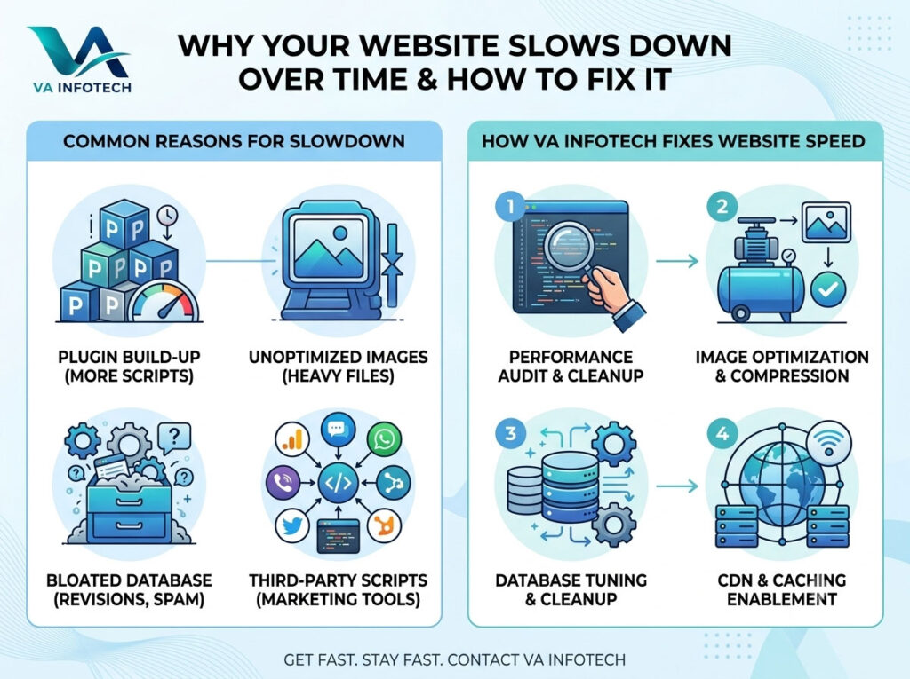
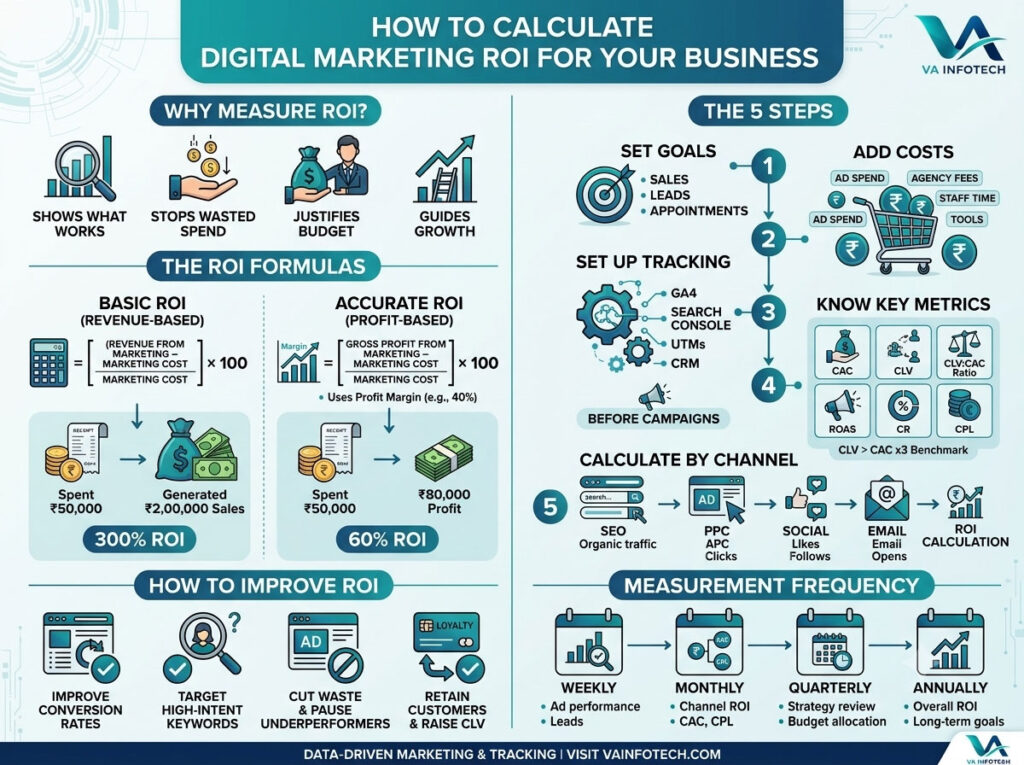
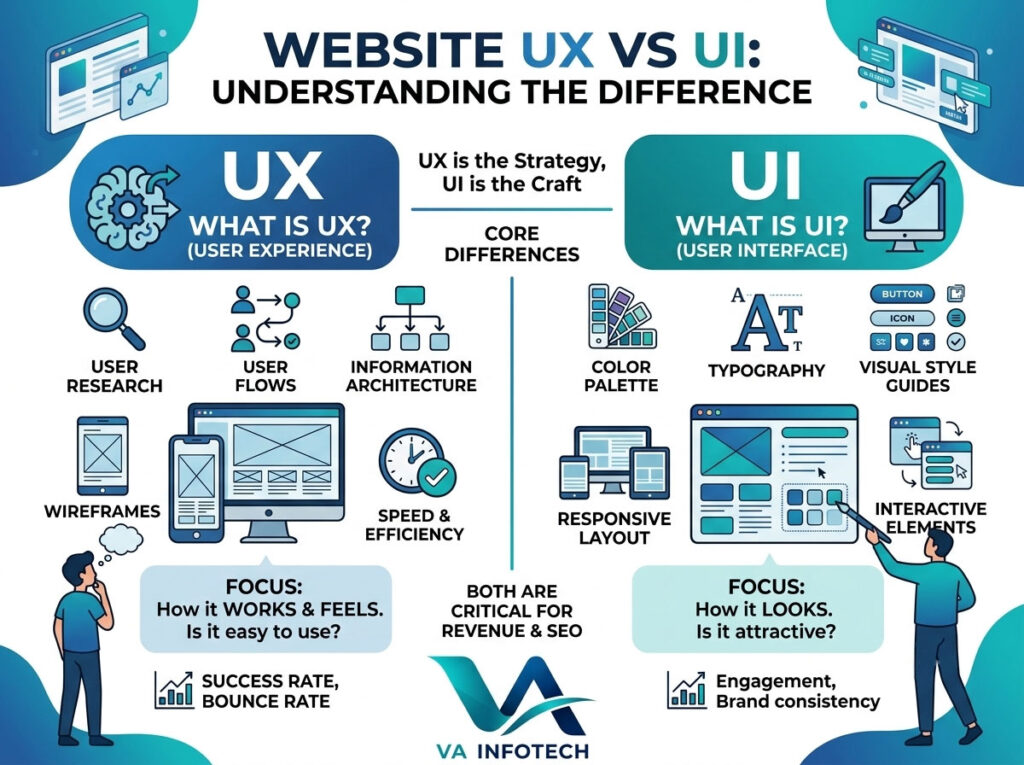
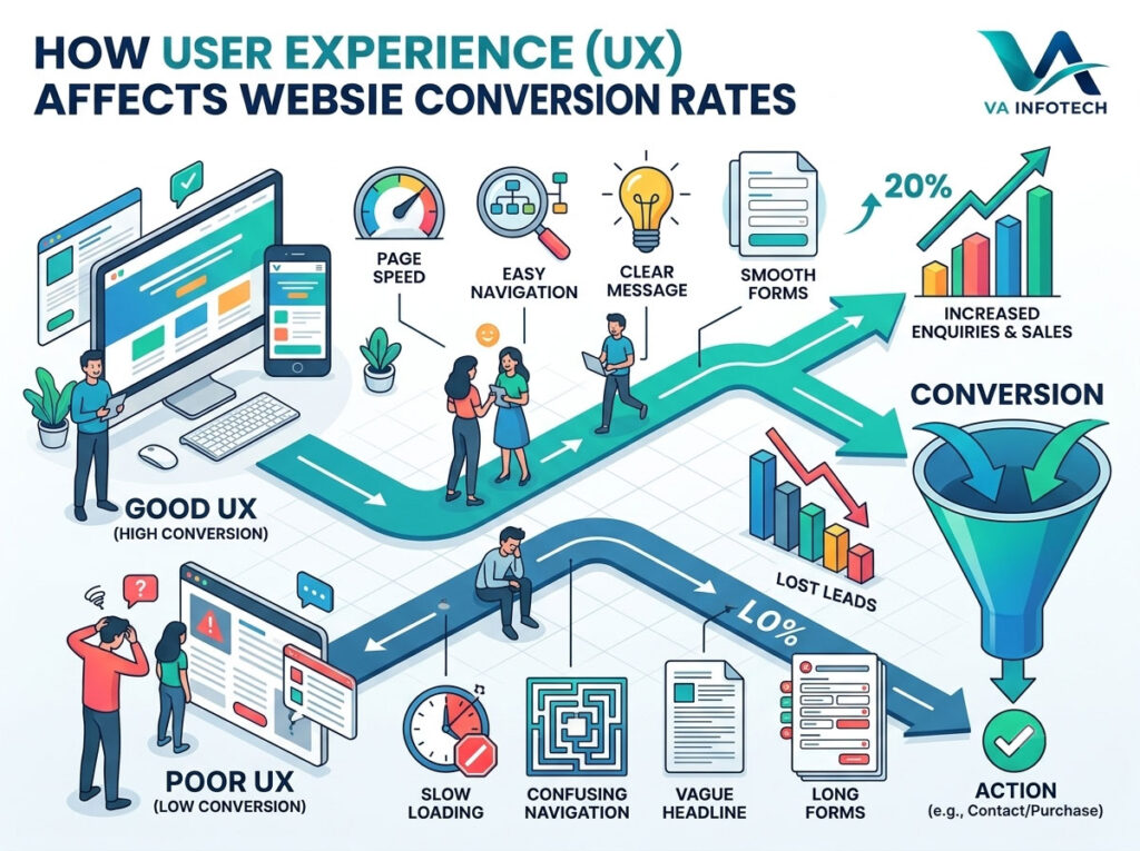
You can have a beautiful website, a steady stream of traffic and a solid marketing budget, and still wonder why so few visitors turn into enquiries or sales. In most cases the answer isn’t the traffic. It’s the experience people have once they arrive. User experience (UX) is the sum of everything a visitor feels and does on your site: how fast pages load, how easy it is to find information, how clear your message is, how simple your forms are, and how confident they feel when it’s time to act. When that experience is smooth, more people convert. When it’s confusing, slow or frustrating, they leave, usually without telling you why. At Va Infotech, we design and build websites for businesses that need results, not just good looks. In this guide, we explain exactly how user experience affects website conversion rates, which UX problems cost you the most leads, and the practical fixes that make the biggest difference. What Is a Website Conversion Rate? A conversion happens when a visitor takes an action you want them to take. That might be filling in a contact form, calling your business, booking a consultation, subscribing to a newsletter, downloading a guide or completing a purchase. Your conversion rate is the percentage of visitors who complete that action. If 1,000 people visit a page and 25 submit an enquiry, your conversion rate on that page is 2.5%. Conversion rate matters because it multiplies the value of everything else you do. Doubling your conversion rate is the same as doubling your traffic, except you don’t pay for more visitors. That’s why it sits at the centre of any serious digital marketing plan, and why it’s one of the first numbers to check when you measure digital marketing ROI. How User Experience Affects Conversion Rates Every visit is a series of tiny decisions. Is this the right site? Can I trust this business? Is it easy to find what I need? Is it worth the effort to continue? UX shapes the answer to each of those questions, usually within seconds. Good UX lowers the effort and the doubt that stand between a visitor and an action. Poor UX raises both. Visitors rarely leave because they dislike your product. They leave because the site made things harder than the alternative. Here’s how that plays out in practice. 1. First Impressions Are Formed Quickly People judge a website almost immediately. Within the first few seconds they decide whether it looks credible, whether it appears relevant to what they searched for, and whether it seems worth their time. A cluttered layout, a vague headline or an outdated design signals risk. A clean layout, a clear headline and a confident visual style signal professionalism. If you want a deeper look at how visual design and interaction design work together here, read our guide on Website UX vs UI: Understanding the Difference. 2. Clarity Beats Cleverness Visitors should understand three things quickly: what you offer, who it’s for and what to do next. Clever taglines, abstract slogans and hidden menus force people to think, and thinking is effort. The highest-converting pages usually state their value plainly. “Website design and development for growing businesses” outperforms an artistic phrase that needs interpretation. 3. Friction Kills Conversions Friction is anything that slows or discourages a visitor from completing an action: too many form fields, unclear buttons, forced account creation, surprise costs, confusing navigation or popups that block content. Each point of friction gives the visitor a reason to quit. The more steps between interest and action, the fewer people make it through. 4. Trust Is a UX Issue People won’t hand over their phone number, email or payment details to a site that doesn’t feel trustworthy. Trust is built through design quality, consistent branding, real contact details, clear policies, genuine testimonials, case studies and a secure connection. Skipping these elements doesn’t just hurt your image. It directly reduces conversions. The UX Factors That Affect Conversion Rates the Most Not every UX improvement carries the same weight. These are the areas that most often decide whether visitors convert. Page Speed and Performance Speed is the foundation of user experience. If a page takes too long to load, many visitors leave before they see anything you’ve built. Slow responses also make the whole site feel unreliable. Performance also tends to decline as a site ages, through plugin build-up, heavy images and outdated hosting. We explain the causes and the fixes in Why Website Speed Gets Slower Over Time and How to Fix It. Good web hosting and regular website maintenance are the two simplest ways to keep your site fast. Aim to meet Google’s Core Web Vitals targets: Largest Contentful Paint of 2.5 seconds or less, Interaction to Next Paint of 200 milliseconds or less and Cumulative Layout Shift of 0.1 or less. Mobile Experience Most visitors now browse on phones. A site that looks good on a desktop monitor but is awkward on a small screen loses a large share of its potential customers. Mobile-friendly UX means: Test your key pages on a real phone, not just a resized browser window. Navigation and Information Architecture If visitors can’t find what they need, they won’t search for long. Good navigation uses familiar labels, a logical structure and a small number of top-level items. Your most important pages, such as services, pricing information, portfolio and contact, should be reachable in one or two clicks. A useful test: ask someone unfamiliar with your business to find a specific service page. If they hesitate, your navigation needs work. Clear Calls to Action A call to action (CTA) tells visitors what to do next. Weak CTAs are the quiet reason many good pages underperform. Effective CTAs are: Content That Answers Questions Visitors come with questions: what does this cost, how does it work, is it right for my situation, what happens next? Pages that answer those questions clearly convert better than pages full of general claims. Good