
You can have a beautiful website, a steady stream of traffic and a solid marketing budget, and still wonder why so few visitors turn into enquiries or sales. In most cases the answer isn’t the traffic. It’s the experience people have once they arrive.
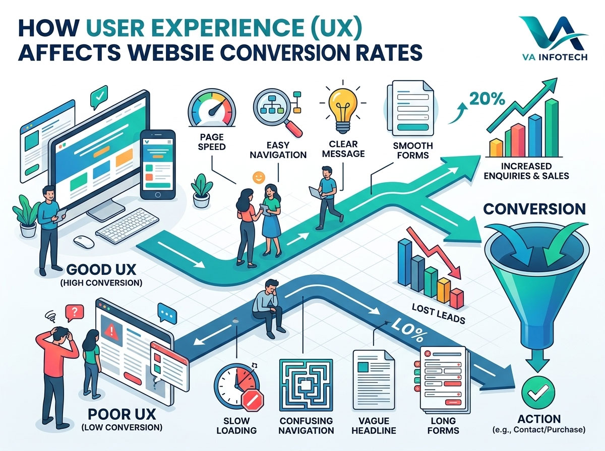
User experience (UX) is the sum of everything a visitor feels and does on your site: how fast pages load, how easy it is to find information, how clear your message is, how simple your forms are, and how confident they feel when it’s time to act. When that experience is smooth, more people convert. When it’s confusing, slow or frustrating, they leave, usually without telling you why.
At Va Infotech, we design and build websites for businesses that need results, not just good looks. In this guide, we explain exactly how user experience affects website conversion rates, which UX problems cost you the most leads, and the practical fixes that make the biggest difference.
What Is a Website Conversion Rate?
A conversion happens when a visitor takes an action you want them to take. That might be filling in a contact form, calling your business, booking a consultation, subscribing to a newsletter, downloading a guide or completing a purchase.
Your conversion rate is the percentage of visitors who complete that action. If 1,000 people visit a page and 25 submit an enquiry, your conversion rate on that page is 2.5%.
Conversion rate matters because it multiplies the value of everything else you do. Doubling your conversion rate is the same as doubling your traffic, except you don’t pay for more visitors. That’s why it sits at the centre of any serious digital marketing plan, and why it’s one of the first numbers to check when you measure digital marketing ROI.
How User Experience Affects Conversion Rates
Every visit is a series of tiny decisions. Is this the right site? Can I trust this business? Is it easy to find what I need? Is it worth the effort to continue? UX shapes the answer to each of those questions, usually within seconds.
Good UX lowers the effort and the doubt that stand between a visitor and an action. Poor UX raises both. Visitors rarely leave because they dislike your product. They leave because the site made things harder than the alternative.
Here’s how that plays out in practice.
1. First Impressions Are Formed Quickly
People judge a website almost immediately. Within the first few seconds they decide whether it looks credible, whether it appears relevant to what they searched for, and whether it seems worth their time.
A cluttered layout, a vague headline or an outdated design signals risk. A clean layout, a clear headline and a confident visual style signal professionalism. If you want a deeper look at how visual design and interaction design work together here, read our guide on Website UX vs UI: Understanding the Difference.
2. Clarity Beats Cleverness
Visitors should understand three things quickly: what you offer, who it’s for and what to do next. Clever taglines, abstract slogans and hidden menus force people to think, and thinking is effort.
The highest-converting pages usually state their value plainly. “Website design and development for growing businesses” outperforms an artistic phrase that needs interpretation.
3. Friction Kills Conversions
Friction is anything that slows or discourages a visitor from completing an action: too many form fields, unclear buttons, forced account creation, surprise costs, confusing navigation or popups that block content. Each point of friction gives the visitor a reason to quit. The more steps between interest and action, the fewer people make it through.
4. Trust Is a UX Issue
People won’t hand over their phone number, email or payment details to a site that doesn’t feel trustworthy. Trust is built through design quality, consistent branding, real contact details, clear policies, genuine testimonials, case studies and a secure connection. Skipping these elements doesn’t just hurt your image. It directly reduces conversions.
The UX Factors That Affect Conversion Rates the Most
Not every UX improvement carries the same weight. These are the areas that most often decide whether visitors convert.
Page Speed and Performance
Speed is the foundation of user experience. If a page takes too long to load, many visitors leave before they see anything you’ve built. Slow responses also make the whole site feel unreliable.
Performance also tends to decline as a site ages, through plugin build-up, heavy images and outdated hosting. We explain the causes and the fixes in Why Website Speed Gets Slower Over Time and How to Fix It. Good web hosting and regular website maintenance are the two simplest ways to keep your site fast.
Aim to meet Google’s Core Web Vitals targets: Largest Contentful Paint of 2.5 seconds or less, Interaction to Next Paint of 200 milliseconds or less and Cumulative Layout Shift of 0.1 or less.
Mobile Experience
Most visitors now browse on phones. A site that looks good on a desktop monitor but is awkward on a small screen loses a large share of its potential customers.
Mobile-friendly UX means:
- Text that is readable without zooming
- Buttons and links big enough to tap accurately
- Menus that are simple and easy to open
- Forms that are quick to complete on a small screen
- Click-to-call buttons for services that people want to ask about directly
Test your key pages on a real phone, not just a resized browser window.
Navigation and Information Architecture
If visitors can’t find what they need, they won’t search for long. Good navigation uses familiar labels, a logical structure and a small number of top-level items. Your most important pages, such as services, pricing information, portfolio and contact, should be reachable in one or two clicks.
A useful test: ask someone unfamiliar with your business to find a specific service page. If they hesitate, your navigation needs work.
Clear Calls to Action
A call to action (CTA) tells visitors what to do next. Weak CTAs are the quiet reason many good pages underperform.
Effective CTAs are:
- Specific. “Get a free website audit” works better than “Submit.”
- Visible. They stand out from the surrounding content through contrast and spacing.
- Placed at decision points. Put them after you’ve explained a benefit, not only at the bottom of the page.
- Limited. One primary action per page keeps visitors focused.
Content That Answers Questions
Visitors come with questions: what does this cost, how does it work, is it right for my situation, what happens next? Pages that answer those questions clearly convert better than pages full of general claims.
Good content for conversion uses short paragraphs, descriptive headings, bullet points and plain language. It addresses objections directly and supports claims with proof, such as examples, results and testimonials. It also matches search intent, which connects UX to SEO. Our Keyword Mapping guide shows how to assign the right topic to every page so visitors land on content that fits what they were looking for.
Forms and Checkout Flows
Forms are where conversions are won or lost. Every extra field is another reason to abandon. Ask only for what you genuinely need to follow up. For many lead generation sites, name, email, phone and a short message are enough.
Improve forms by:
- Using clear labels and helpful error messages
- Avoiding unnecessary required fields
- Showing progress on multi-step forms
- Confirming submission clearly
- Making sure forms work properly on mobile
For online stores, the same principle applies across the whole purchase journey. Offer guest checkout, show total costs early, support familiar payment methods and make delivery information easy to find. Our eCommerce website design work focuses on removing exactly these points of friction.
Product and Service Page Experience
Individual pages need to do real selling work. A product page should include clear images, a descriptive headline, benefits, specifications, pricing, reviews and an obvious buy button. A service page should explain the problem, the solution, the process and the next step. For stores, our guide on Product Page SEO covers how to structure these pages for both search engines and shoppers.
Visual Design and Consistency
Design supports conversion when it guides attention. Strong visual hierarchy tells visitors where to look first, second and third. Consistent fonts, colours and spacing create a sense of order and reliability. Generous white space makes content easier to read. Overly busy pages, too many competing colours and decorative animations pull focus away from the action you want.
Accessibility
An accessible website works for everyone, including people with visual, motor or hearing impairments, and people using assistive technology. Good contrast, readable text, descriptive image alt text, keyboard-friendly navigation and clear form labels help all users, and they expand the audience who can actually complete a conversion on your site.
Common UX Mistakes That Lower Conversion Rates
If your conversion rate is lower than you’d like, check for these frequent problems:
- Slow-loading pages, especially on mobile
- Vague headlines that don’t say what you do
- Too many choices or too many competing buttons
- Hidden or weak calls to action
- Long, intrusive forms
- Pop-ups that interrupt the reading experience
- Poor mobile layouts
- Missing trust signals such as testimonials, case studies and contact details
- Broken links and error pages
- Outdated design that makes the business look inactive
- Inconsistent messaging between an ad or search result and the landing page
That last point deserves attention. If you pay for traffic, the landing page experience matters as much as the ad itself. A well-targeted campaign sent to a confusing page wastes budget, which is why PPC setup and marketing should always be planned together with landing page design.
How UX and SEO Work Together
UX and SEO are closely linked. Search engines want to send people to pages that satisfy them, and a site that is fast, easy to use and well organised tends to perform better in search. Page experience is one of the signals Google considers, alongside content relevance and quality.
The benefit runs both ways. Search engine optimization brings the right visitors, and good UX turns those visitors into enquiries. Ranking without converting is wasted effort, and converting without traffic limits your growth. You need both.
If local customers are your focus, UX matters even more, because many local searches happen on phones by people ready to act. Our guide on How to Get More Local Leads From Google Search explains how to pair local visibility with a site that converts.
Search is also changing. As AI-generated answers become more common, clear structure, direct answers and trustworthy content help your pages get understood and cited. Read Google AI Overviews SEO and learn about our Large Language Model SEO service to see how this affects your visibility.
How to Find UX Problems on Your Own Website
You don’t need to guess what’s wrong. Several free and low-cost methods show you where visitors struggle.
- Check your analytics. Look at bounce rate, time on page, exit pages and conversion paths. Pages with high traffic and low conversions are your best opportunities.
- Watch session recordings and heatmaps. These show where people click, how far they scroll and where they hesitate or leave.
- Run real user tests. Ask five people to complete a task on your site while you watch quietly. You’ll spot issues quickly.
- Review speed and Core Web Vitals. Use Google PageSpeed Insights and the Core Web Vitals report in Google Search Console.
- Collect feedback. A short on-page survey or a question to recent customers can reveal what confused them.
- Audit the whole site. A structured review catches technical and content issues together. Our Complete SEO Audit Checklist for Business Websites is a useful starting point.
Practical Steps to Improve Conversions Through Better UX
Once you know where the problems are, work through them in order of impact.
Step 1: Fix Speed First
Compress images, remove unused plugins, enable caching and make sure your hosting can handle your traffic. Speed improvements help every other page on the site.
Step 2: Clarify Your Message
Rewrite your homepage headline and key service page openings so a new visitor understands your offer immediately. State what you do, who you help and what makes you different.
Step 3: Simplify Navigation
Reduce menu items, use clear labels and make sure your top pages are easy to reach. Add a visible contact option on every page.
Step 4: Strengthen Calls to Action
Use one clear primary CTA per page, written in specific language and placed where interest is highest. Repeat it naturally throughout longer pages.
Step 5: Shorten Forms
Remove every field that isn’t essential. Test the form on mobile and confirm that submissions arrive properly.
Step 6: Add Proof
Include testimonials, case studies, client logos, certifications and a visible portfolio. Real examples reduce doubt more effectively than claims.
Step 7: Optimise for Mobile
Review every key page on a phone. Check text size, tap targets, spacing and loading behaviour.
Step 8: Test and Improve Continuously
Change one thing at a time, measure the result and keep what works. A/B testing headlines, CTAs and layouts builds steady gains. Conversion improvement is an ongoing process, not a one-time project.
When Small Fixes Aren’t Enough
Sometimes the issue runs deeper than a few tweaks. If your site is built on an outdated structure, a heavy theme or a layout that was never designed for conversion, patching will only go so far. In those cases a website redesign built around user journeys and business goals delivers better value than years of piecemeal fixes.
If you’re planning a rebuild, think carefully about platform and budget. Our comparison of WordPress vs Custom Website Development can help you choose, and How Much Does Website Development Cost in India in 2026? gives realistic budget guidance. To plan the surrounding marketing spend, see How Much Should a Small Business Spend on Digital Marketing?
If your site holds a lot of enquiries, orders or customer data, protect it too. A good website backup strategy means a failed update never costs you conversions or credibility.
How to Measure UX Success
Track the numbers that show whether your changes are working:
- Conversion rate by page, device and traffic source
- Bounce rate and engagement time
- Form completion rate and abandonment points
- Cart abandonment and checkout completion for online stores
- Page speed and Core Web Vitals
- Return visitors and enquiry quality
Always measure against a baseline taken before you make changes, and give each change enough time and traffic to produce a meaningful result.
Frequently Asked Questions
How does user experience affect website conversion rates?
UX affects conversion rates by determining how easy, fast and trustworthy it feels to take action on your site. Clear messaging, quick loading, simple navigation and low-friction forms increase the percentage of visitors who convert. Confusing or slow experiences push them away.
What is a good website conversion rate?
It varies widely by industry, traffic source, price point and the action being measured. Instead of chasing a universal benchmark, compare your own pages over time and aim for steady improvement.
Does website design affect conversions?
Yes. Design shapes first impressions, credibility and attention. Strong visual hierarchy, consistent branding and clear layouts guide visitors toward your calls to action.
Does page speed affect conversion rates?
Yes. Slow pages frustrate visitors and increase the likelihood that they leave before engaging. Speed also supports search performance through Core Web Vitals.
What is the difference between UX and conversion rate optimization?
UX focuses on the overall quality of a visitor’s experience. Conversion rate optimization (CRO) is the structured process of testing and improving specific elements to increase the percentage of visitors who take action. Good UX is the foundation, and CRO fine-tunes it.
How long does it take to see results from UX improvements?
Some fixes, such as speeding up pages or simplifying a form, can show results within weeks. Larger changes take longer to measure, especially on sites with lower traffic.
Can a small business improve UX without a full redesign?
Often yes. Speed optimisation, clearer headlines, stronger CTAs, shorter forms and better mobile layouts can all be done on an existing site. A redesign is worth considering only when the underlying structure is limiting results.
Final Thoughts
Traffic gets people to your website, but user experience decides what they do when they get there. Every second of delay, every unclear message and every unnecessary form field is a small leak in your conversion funnel. Fixing those leaks is often the highest-return improvement a business can make, because it increases the value of every visitor you already attract.
Start with the basics: make your site fast, make your message clear, make navigation simple and make the next step obvious. Then keep measuring and refining.
At Va Infotech, we help businesses build and improve websites that look professional and convert visitors into customers, from website design and eCommerce development to SEO, web hosting and ongoing website maintenance. If you’d like an expert review of where your site is losing leads, contact us for a free consultation. You can also explore more guides on the Va Infotech blog or visit vainfotech.com to learn more.